MERIDIAN
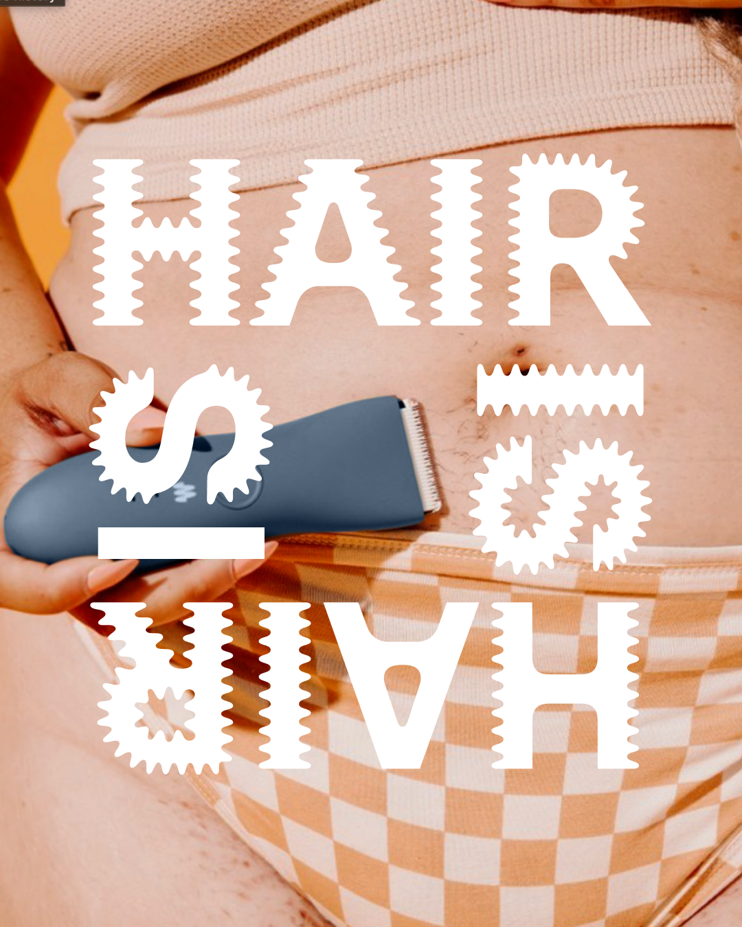
Meridian is challenging preconceived notions of haircare. Who it’s on, where it’s at, and how much of it is there. Want a trim? Here are the perfect tools. Want to let it grow? Then let it show. Hair is hair. We built a system that champions body positivity and inclusivity, owning the idea of revamping your routine and your relationship with hair—everywhere.
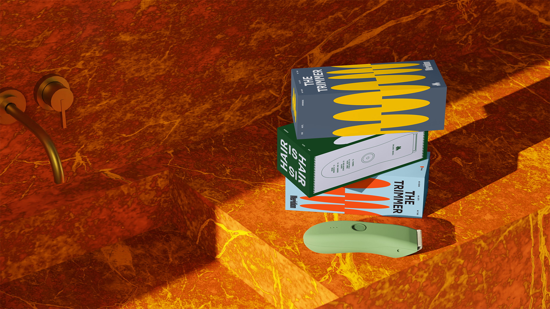
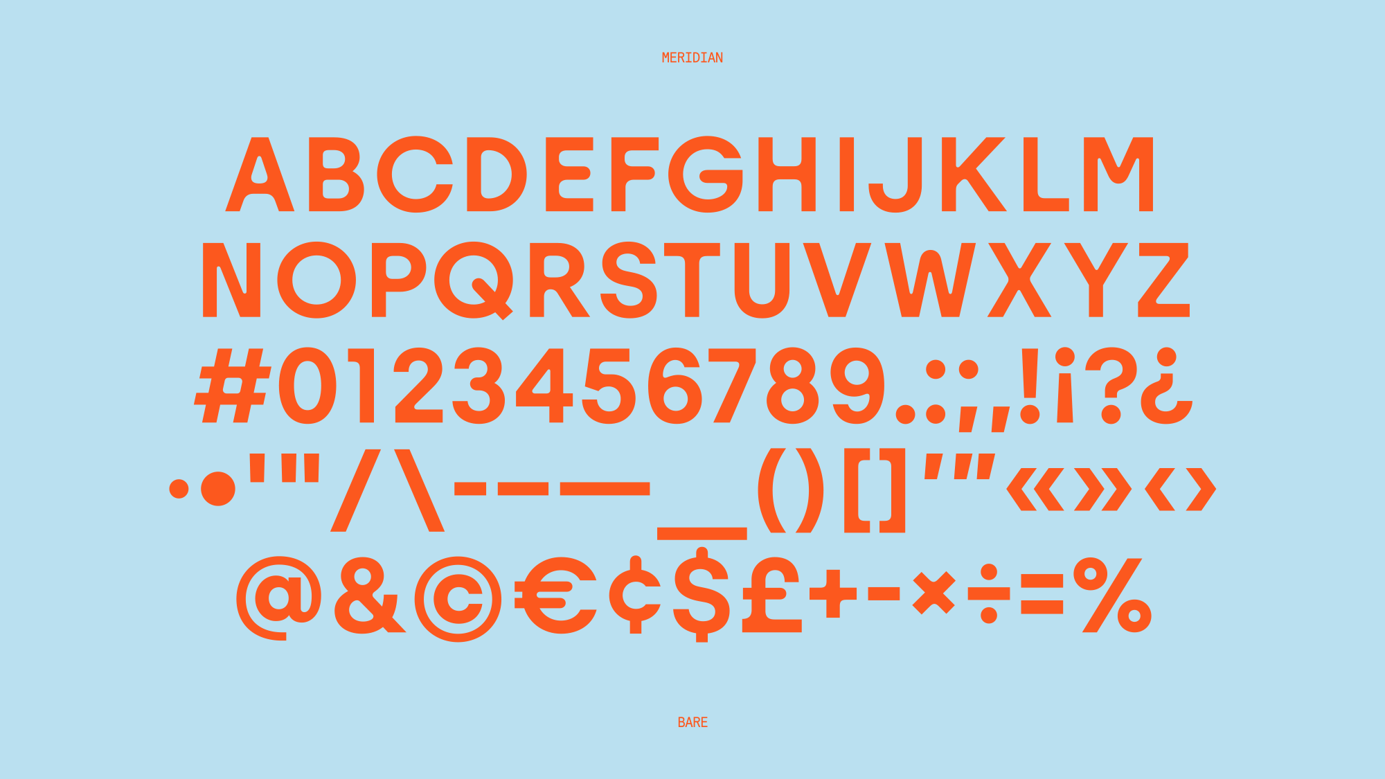
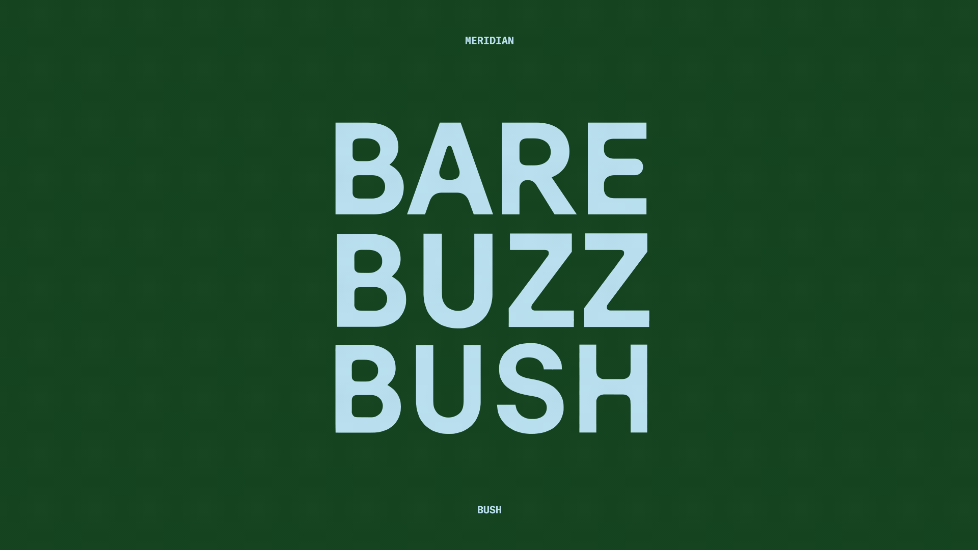
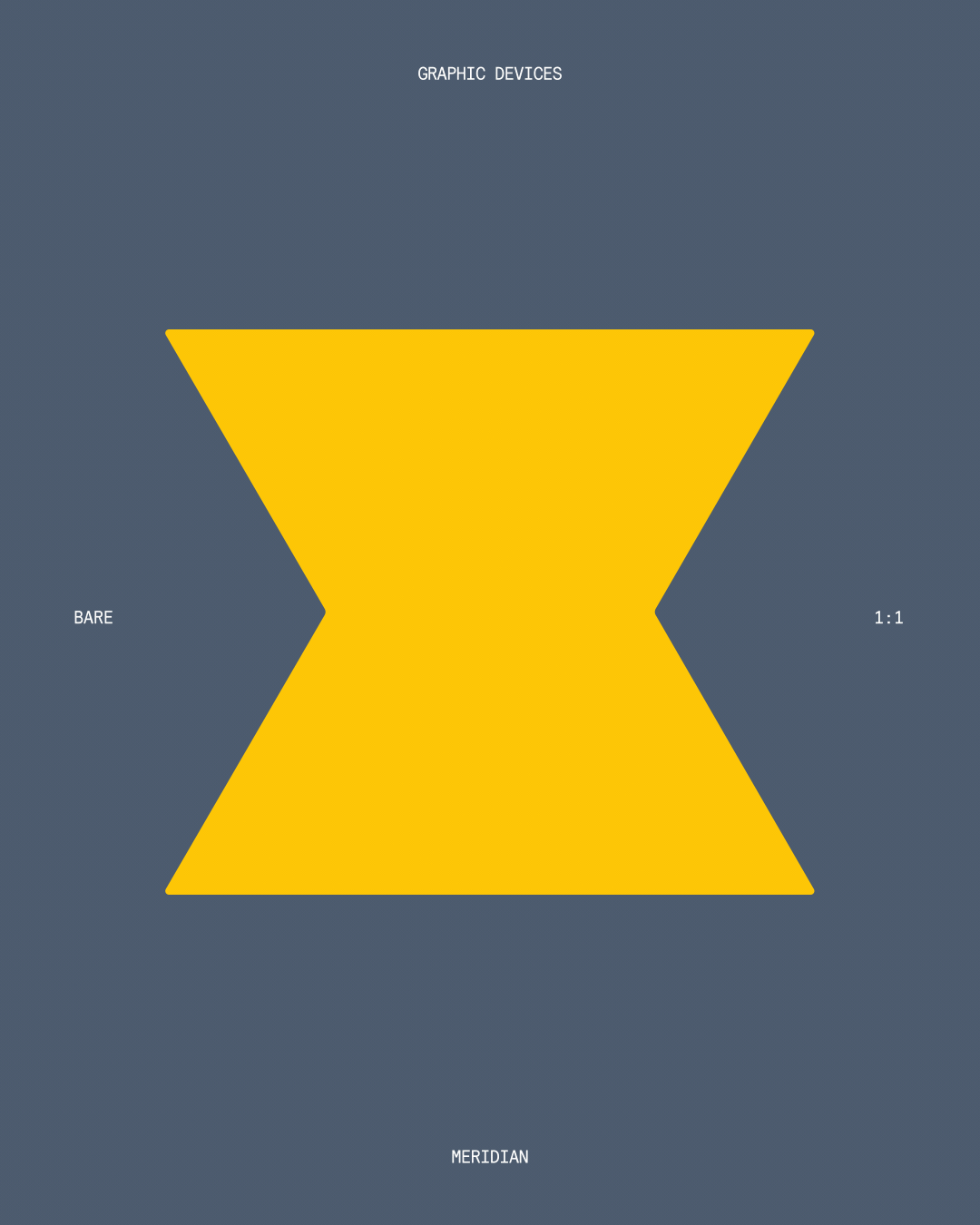
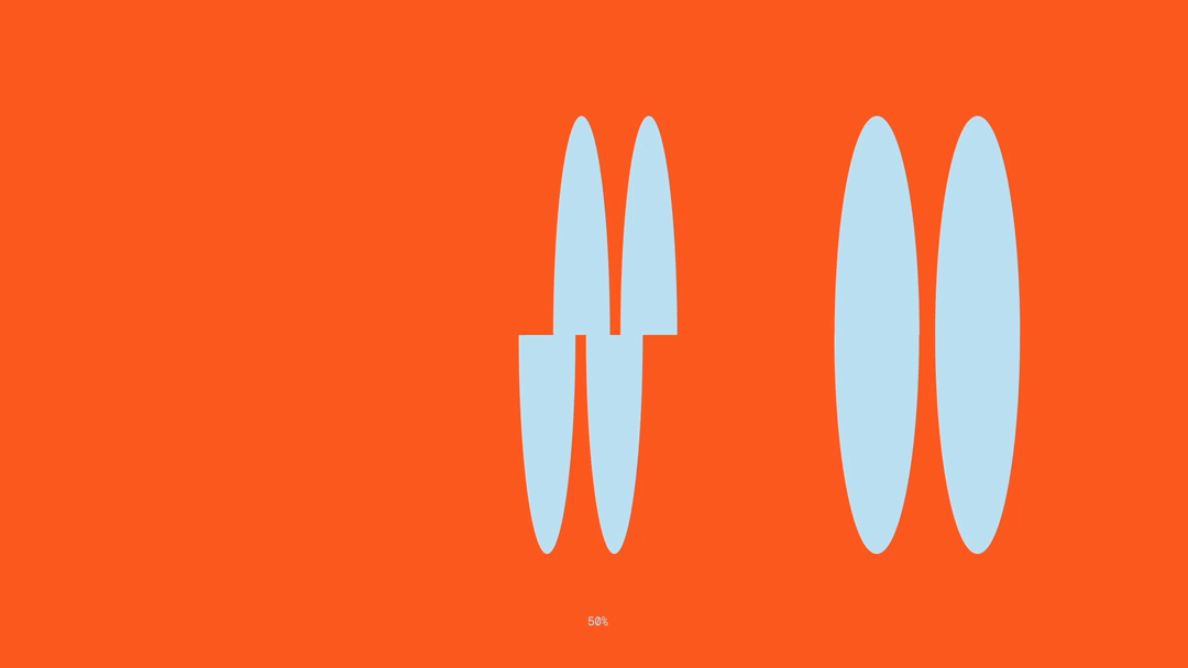
We worked with AllCaps to build a custom typeface around expressing one’s grooming preferences through three distinct weights, Bare, Buzz, and Bush. When each weight is seen in line, the typeface speaks to body diversity and the growth process, emphasizing the uniqueness of our individual self-expression. Similarly, our graphic elements also utilize the Bare, Buzz, and Bush spectrum. The shapes act as a container for imagery, headlines, or as an abstract representation of hair–anywhere.
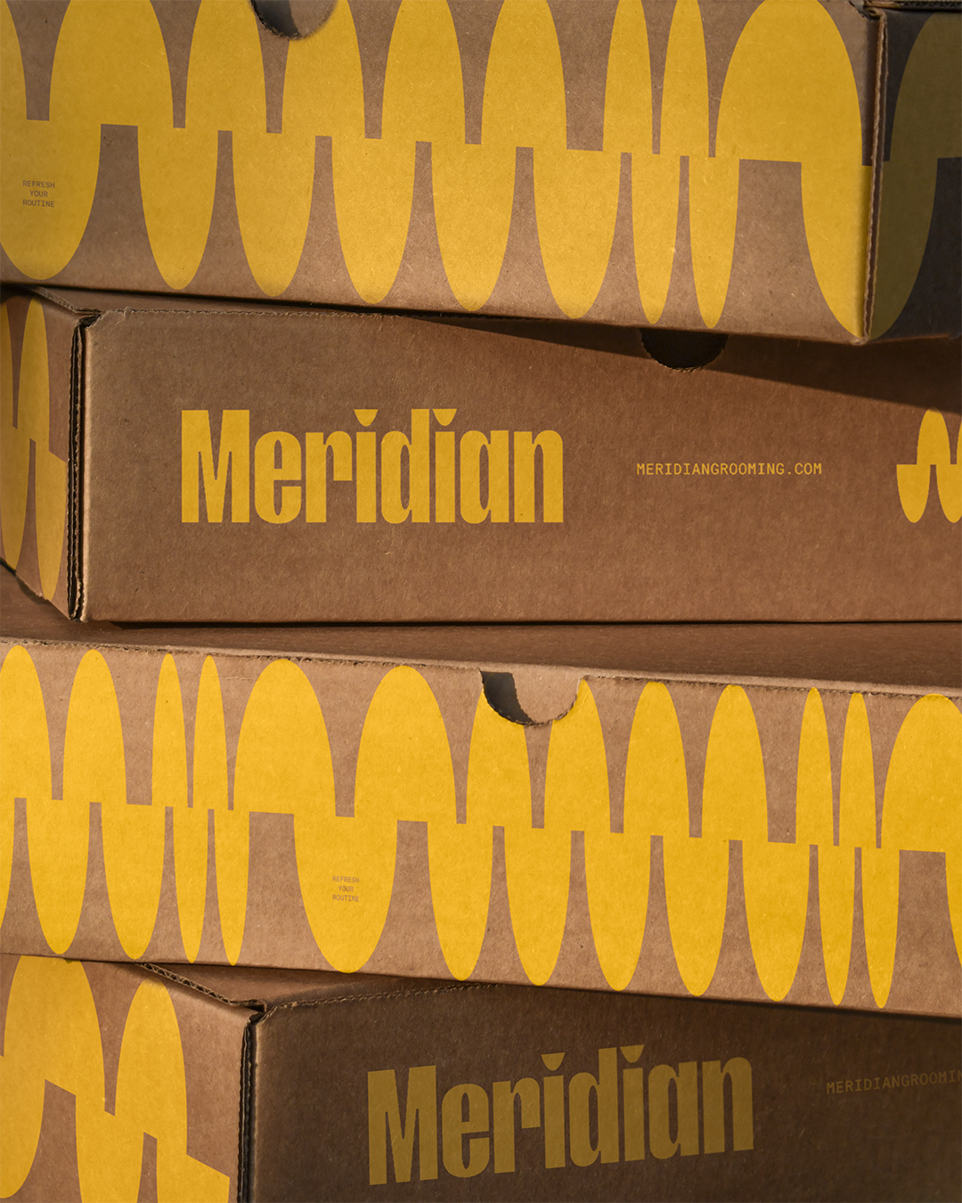
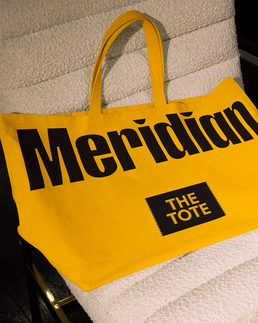
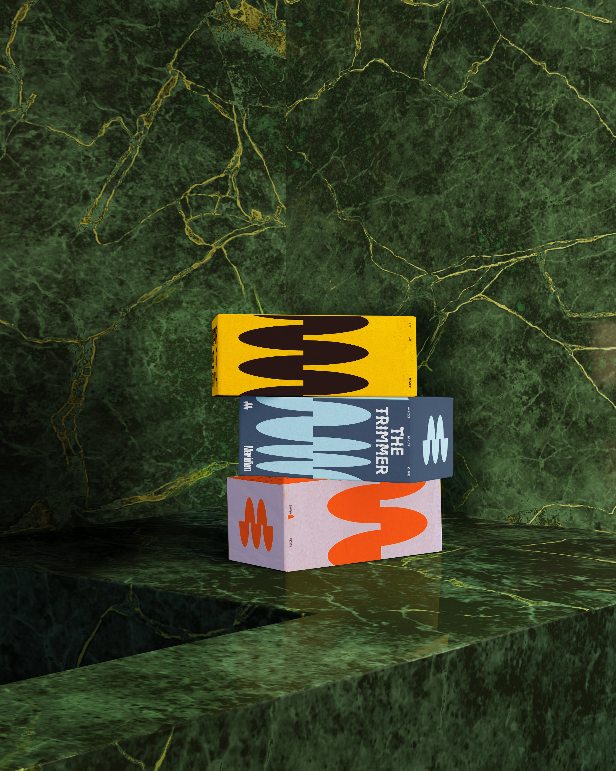
Meridian lines have been used for navigation and exploration for centuries. We used this idea to inform the logo we crafted because of the brand’s namesake, but also because personal grooming is a way of navigating your own landscape in a way that's entirely unique to you. Our graphic pattern is an extension of the Meridian symbol, representing both fluidity and growth.
We worked with AllCaps to build a custom typeface around expressing one’s grooming preferences through three distinct weights, Bare, Buzz, and Bush. When each weight is seen in line, the typeface speaks to body diversity and the growth process, emphasizing the uniqueness of our individual self-expression. Similarly, our graphic elements also utilize the Bare, Buzz, and Bush spectrum. The shapes act as a container for imagery, headlines, or as an abstract representation of hair–anywhere.
Meridian lines have been used for navigation and exploration for centuries. We used this idea to inform the logo we crafted because of the brand’s namesake, but also because personal grooming is a way of navigating your own landscape in a way that's entirely unique to you. Our graphic pattern is an extension of the Meridian symbol, representing both fluidity and growth.