BREADHEAD
Rebrand for a Michelin star sandwich shop in Los Angeles, CA.
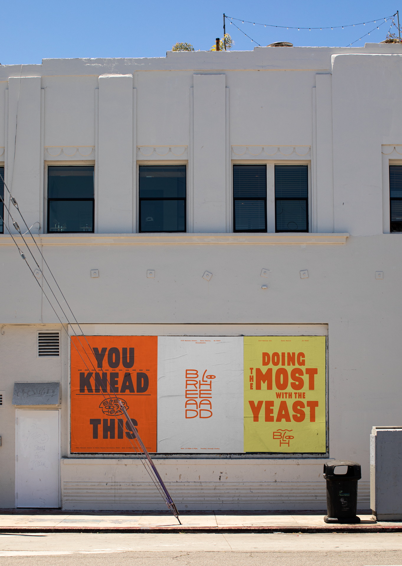
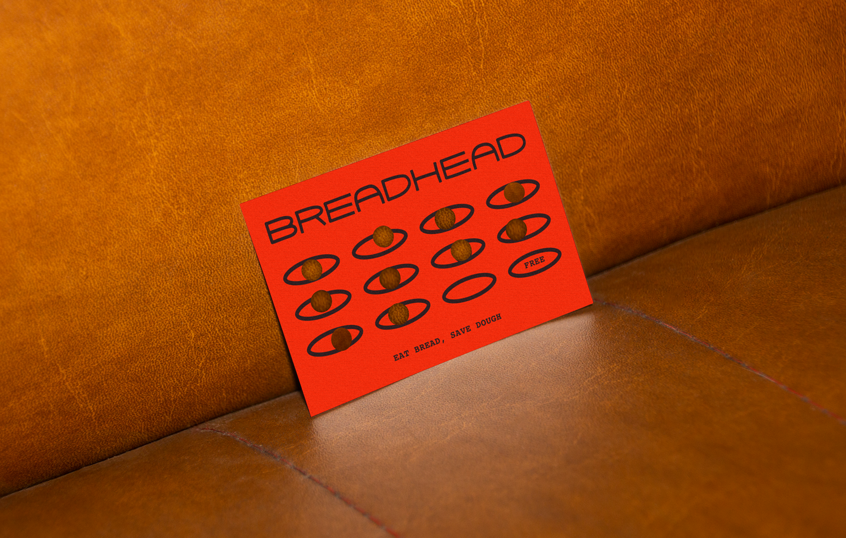
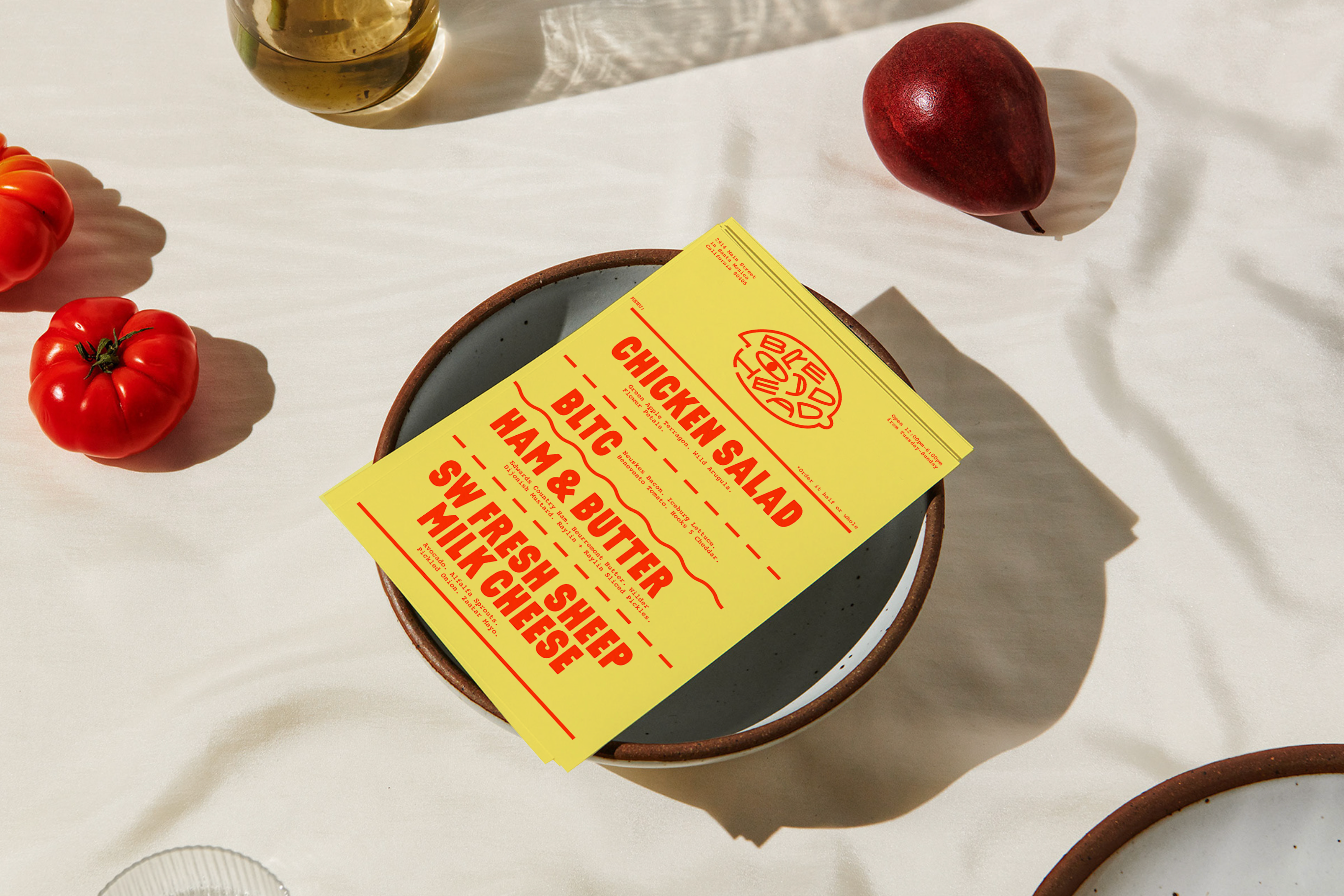
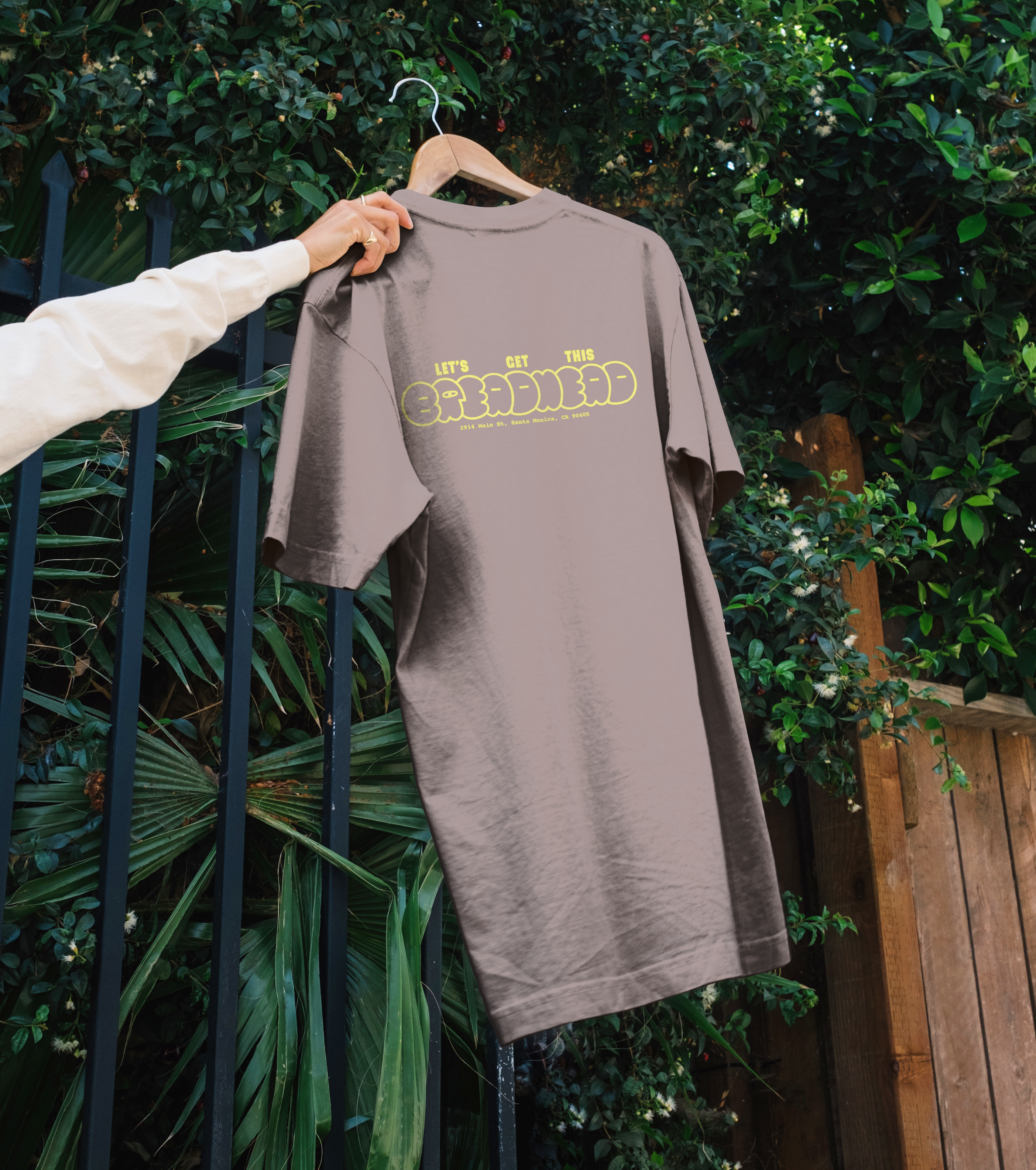
The clients were looking for something unpretentious and simple, so we created a suite of wordmarks and symbols that felt hand-drawn yet still refined. The two main symbols are the breadheads, whose proportions are modeled from the breadpans the foccacia is baked in. They contain the signature eye as well as custom letters that maintain that same pan proportion. The “H” from BREADHEAD serves as the characters’ closed grinning mouths, mid chew with their mouths full.
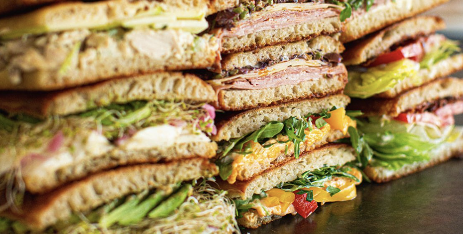
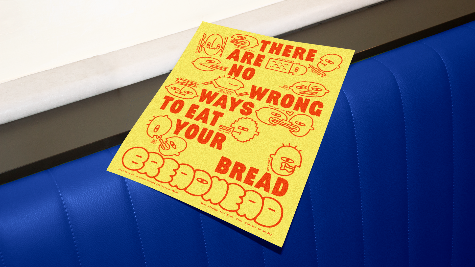
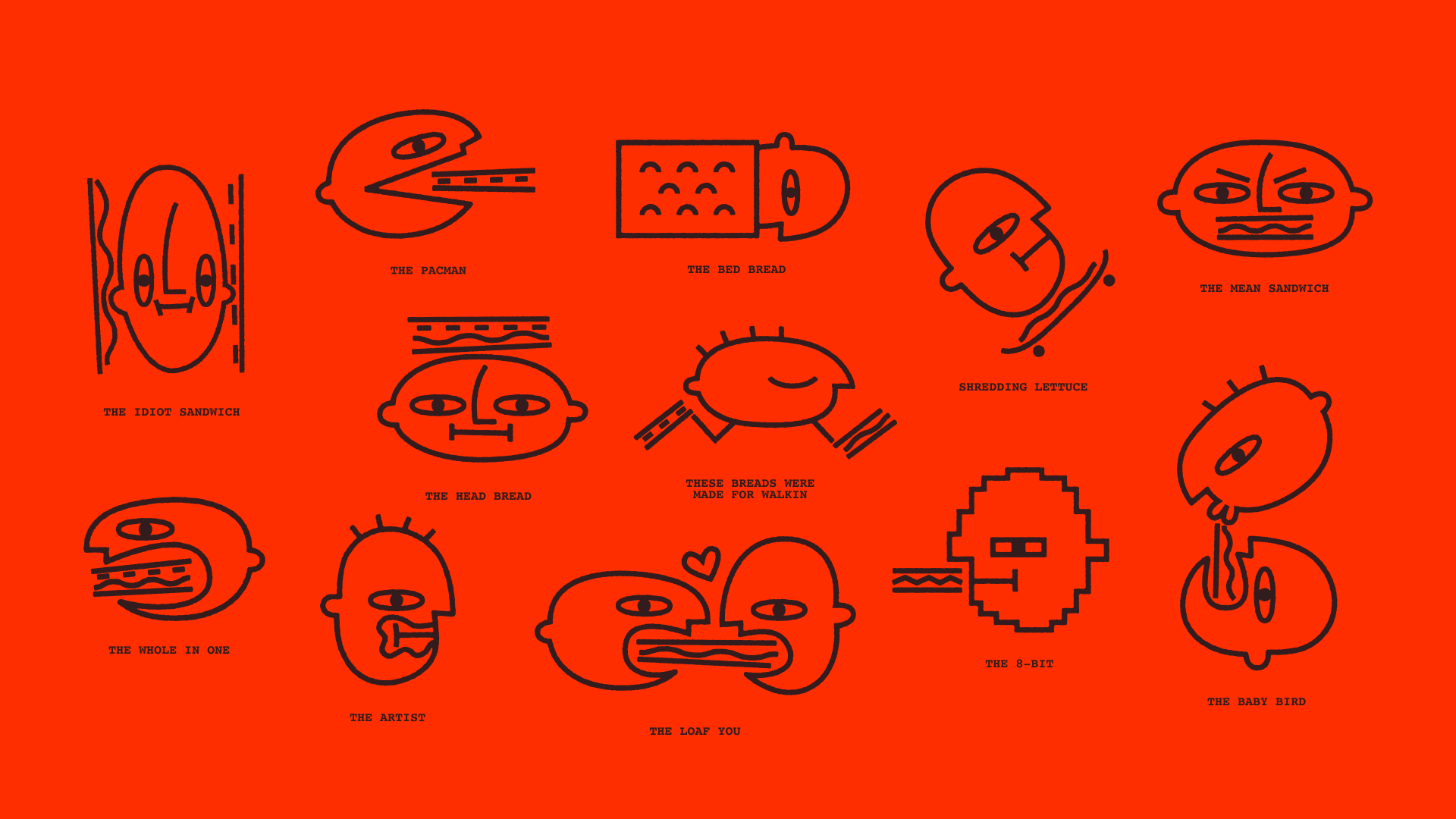
The illustration library depicts alternative ways to eat the sandwiches. In order to remain distinct and cohesive, every illustration utilizes our established graphic elements to represent a sandwich, each with a distinct Breadhead eye and silhouetted head.
The clients were looking for something unpretentious and simple, so we created a suite of wordmarks and symbols that felt hand-drawn yet still refined. The two main symbols are the breadheads, whose proportions are modeled from the breadpans the foccacia is baked in. They contain the signature eye as well as custom letters that maintain that same pan proportion. The “H” from BREADHEAD serves as the characters’ closed grinning mouths, mid chew with their mouths full.
The illustration library depicts alternative ways to eat the sandwiches. In order to remain distinct and cohesive, every illustration utilizes our established graphic elements to represent a sandwich, each with a distinct Breadhead eye and silhouetted head.